
The Pantone Colour Of The Year For 2020 Is 'Classic Blue'
WHAT IS PANTONE’S COLOUR OF THE YEAR FOR 2020?
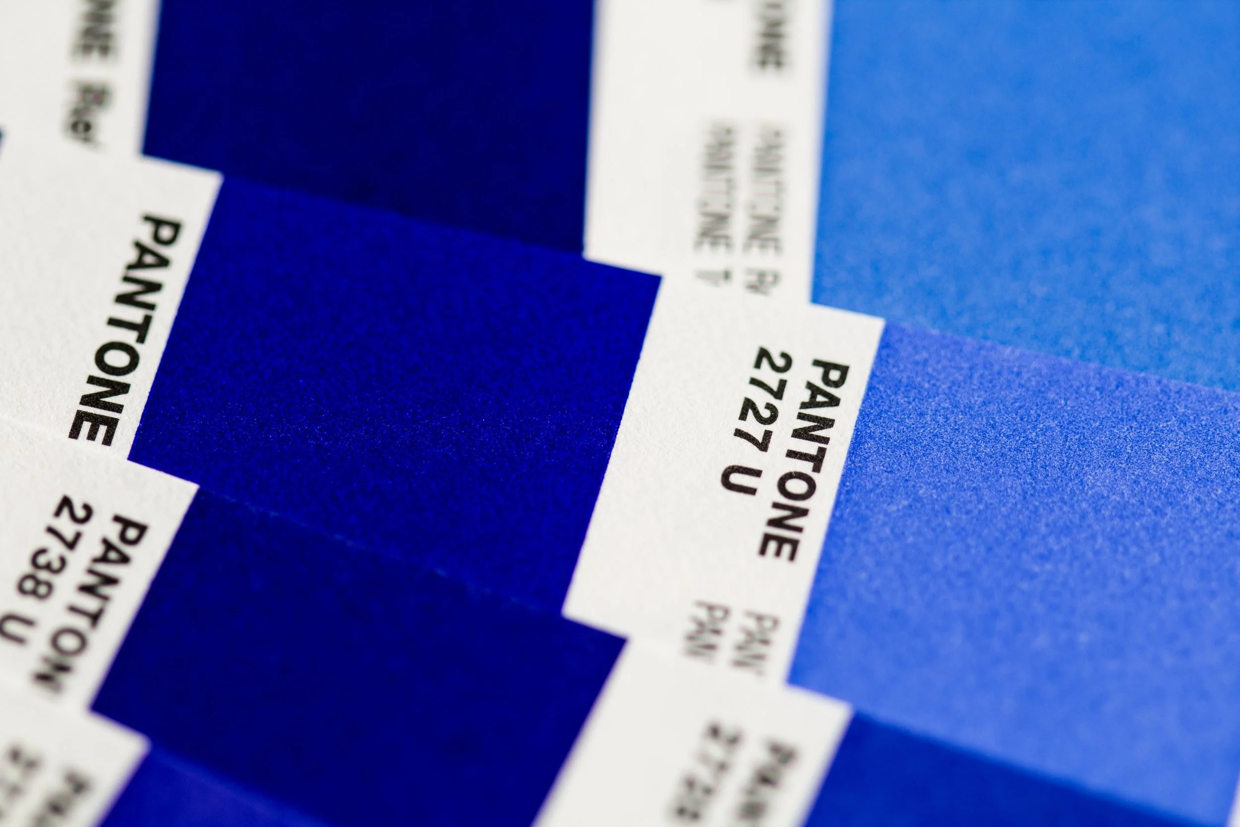
The anticipation is finally over: we had a sneak preview alluding to Neon Mint, Urban Pink Pastels and daring deep ochre’s, but finally Pantone have released their eagerly awaited 2020 colour of the year. The confirmed choice was something of a surprise but a most welcomed one: ‘Classic Blue’ Pantone number: 19-4052, the global universal staple.
There is so much richness and depth in this blue and teamed with the dynamism of a red undertone it offers a wealth of variety in its use across interiors, fashion, Art & Design. This timeless classic transcends fashion and trends and is an anchor staple that you can mix with literally everything!
Classic Blue speaks to versatility and has an emblematic heritage, it is distinctive and extraordinary in its presence, and evokes feelings of trust, calmness, peaceful tranquillity, warmth, soothing and thoughtfulness whilst all combined with universal qualities of modernity, elegance and refinement.
Pantone have set Classic Blue admirably against a selection of rich accents. It was fantastic to see their colour releases support SPEAK’s 2019 predicted and recommended accents for 2020, confirmed by Pantone: stand out shades include: Brass Knuckle and Pixie, the best part about this colour palette is you can quite literally never fail.
DID YOU KNOW?
Blue is one of the most calming and serene colours, aiding relaxation and encouraging sleep. Blue is scientifically proven to lower blood pressure, and for this reason it is the colour most encouraged to incorporate into your interior space.

A timeless and enduring blue hue, PANTONE 19-4052 Classic Blue is elegant in its simplicity. Suggestive of the sky at dusk, the reassuring qualities of the thought-provoking PANTONE 19-4052 Classic Blue highlight our desire for a dependable and stable foundation on which to build as we cross the threshold into a new era.
Imprinted in our psyches as a restful colour, PANTONE 19-4052 Classic Blue brings a sense of peace and tranquility to the human spirit, offering refuge. Aiding concentration and bringing laser like clarity, PANTONE 19-4052 Classic Blue re-centers our thoughts. A reflective blue tone, Classic Blue fosters resilience.
As technology continues to race ahead of the human ability to process it all, it is easy to understand why we gravitate to colours that are honest and offer the promise of protection. Non-aggressive and easily relatable, the trusted PANTONE 19-4052 Classic Blue lends itself to relaxed interaction. Associated with the return of another day, this universal favorite is comfortably embraced.
Video Credit: Pantone
Like | Connect | Share

Hello From Speak,
We relish the opportunity to home stage and create interior design’s that inspires. We love to maximise space, leverage colour, and blend architectural features with modern design.
Contact us to SPEAK about your home staging or interior design project’s. We would love to hear from you and explore the rich possibilities!